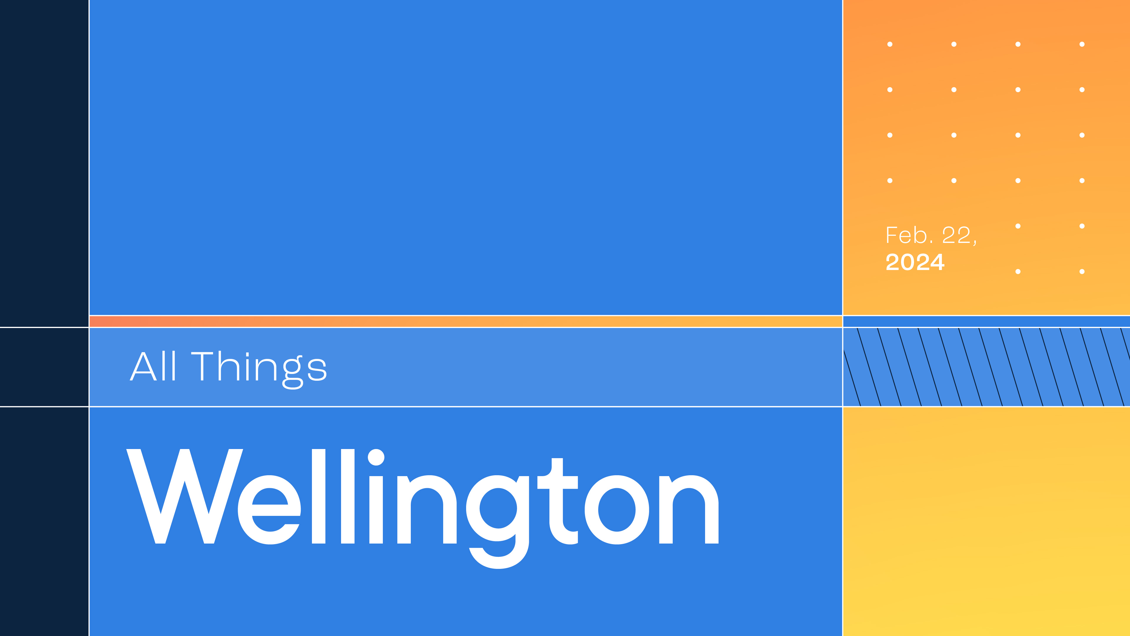
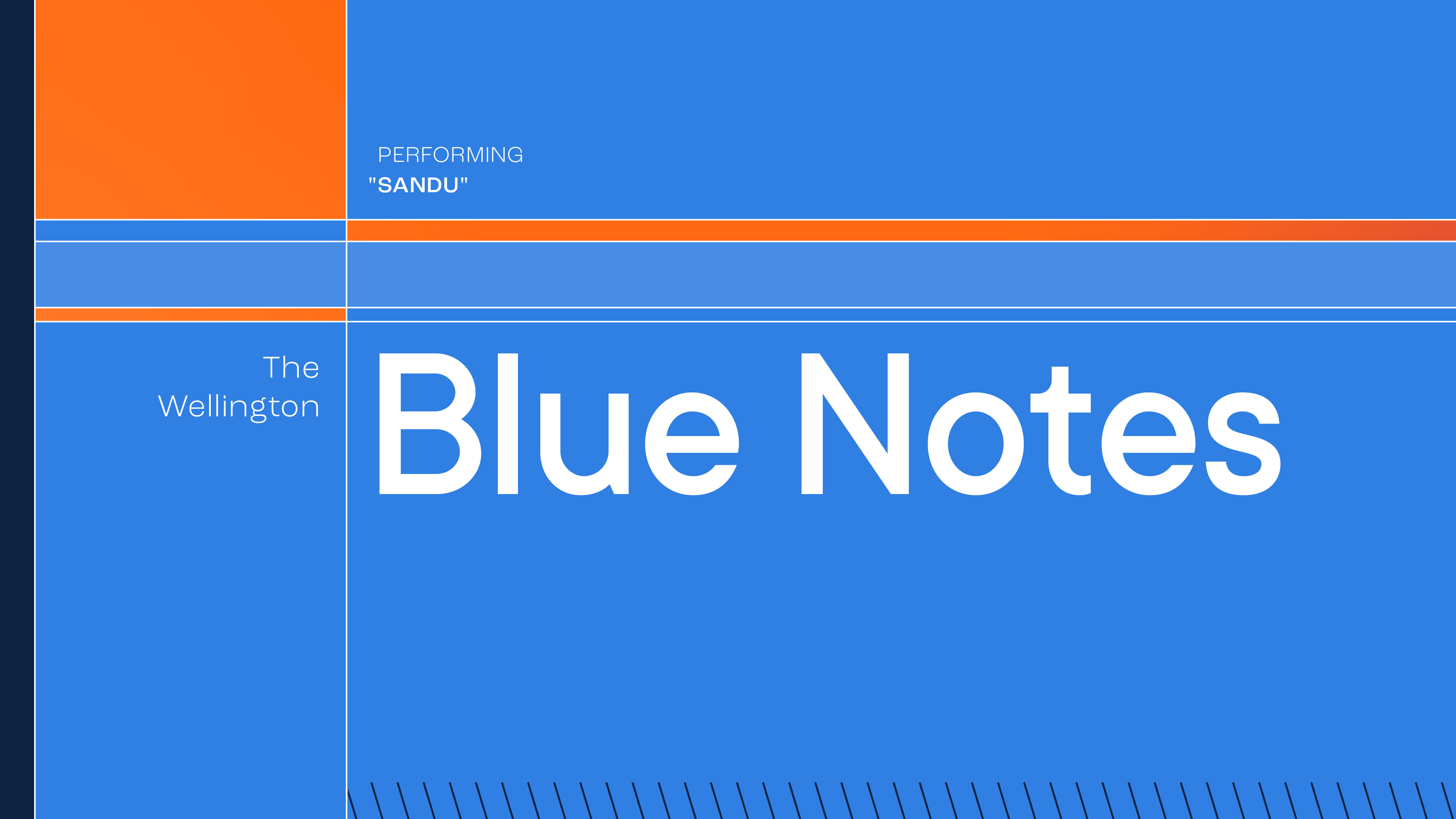
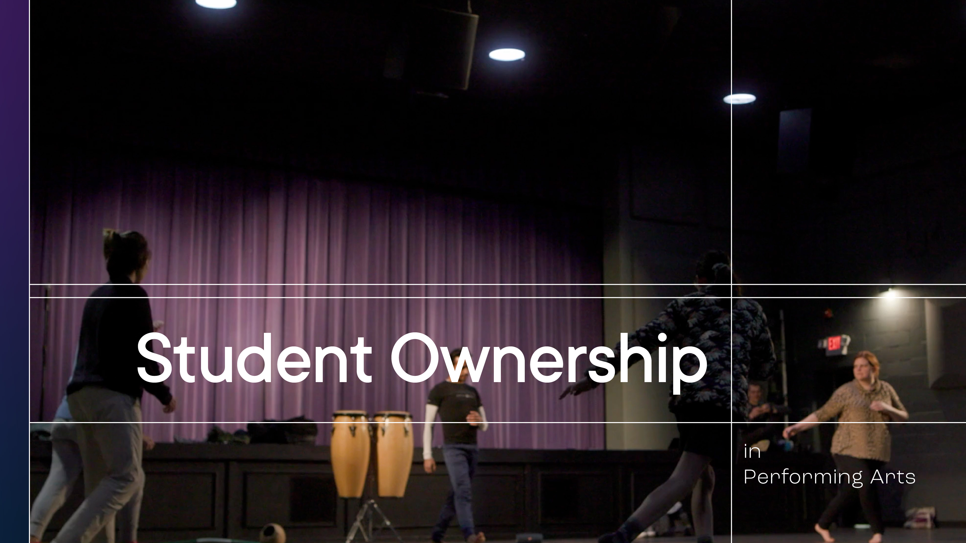
All Things Wellington is an annual event that invites parents and community members to hear about the programs and student experiences at The Wellington School. 2024 was the third year the school worked with our studio to organize media for the event. Our video department shot and created videos that ran in between in-person speakers and performances. My role was to handle the creation of all motion graphics that appeared on screen during the event. This included elements like title cards and thirds that existed within pre-recorded content—as well as event opening / closing and speaker introduction graphics.
ABOVE: As guests entered the auditorium, a loop played onscreen that cycled through seemingly random movements of line work as it shifted and opened and closed different quadrants. When it was showtime, the entrance loop faded to black and the intro animation began. The intro ends on a title card introducing the head of school to kick off the event.
What follows is sequences of media in the order that they were presented at the event.The run of show is made up of a combination of in-person speakers and performances and pre-recorded videos. This includes the speaker introduction animations, title cards, animations within the pre-recorded video, and lower thirds.
Development
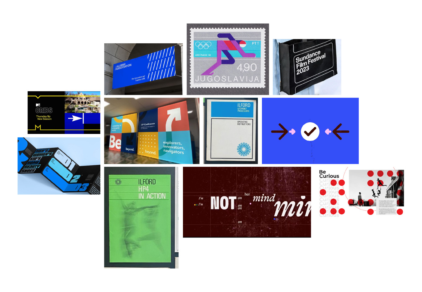
For this year’s event I was asked to bring a more elevated and impressive feel / “wow” element to the look of things. My initial mood board and concept pitches were created with what they had responded to positively in the past, while also taking into account this idea of elevating things. As part of this elevation effort, I introduced a potential secondary typeface with each concept I created.
Concept 1
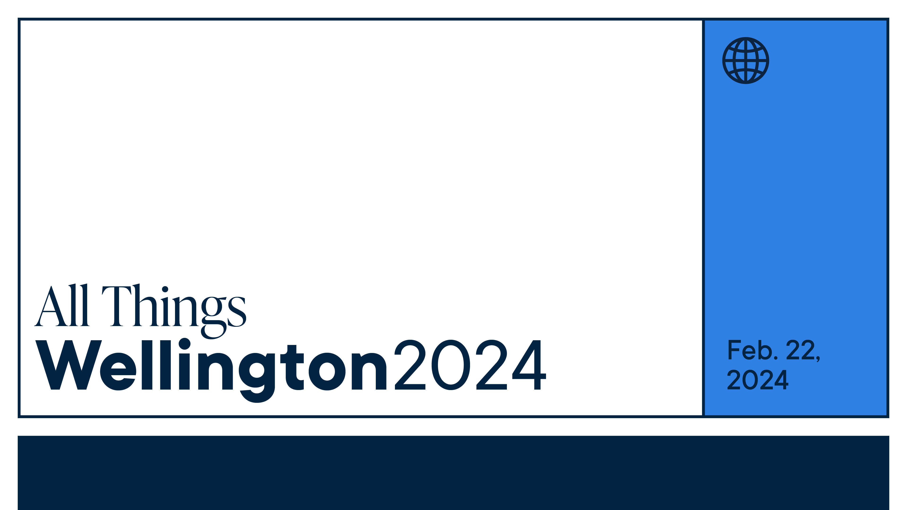
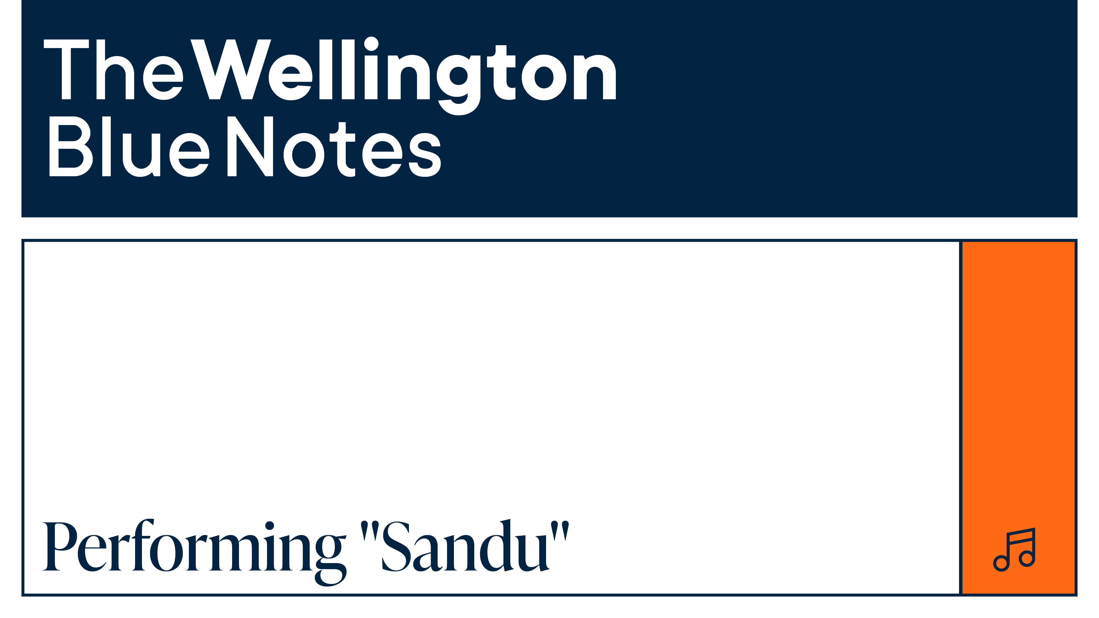
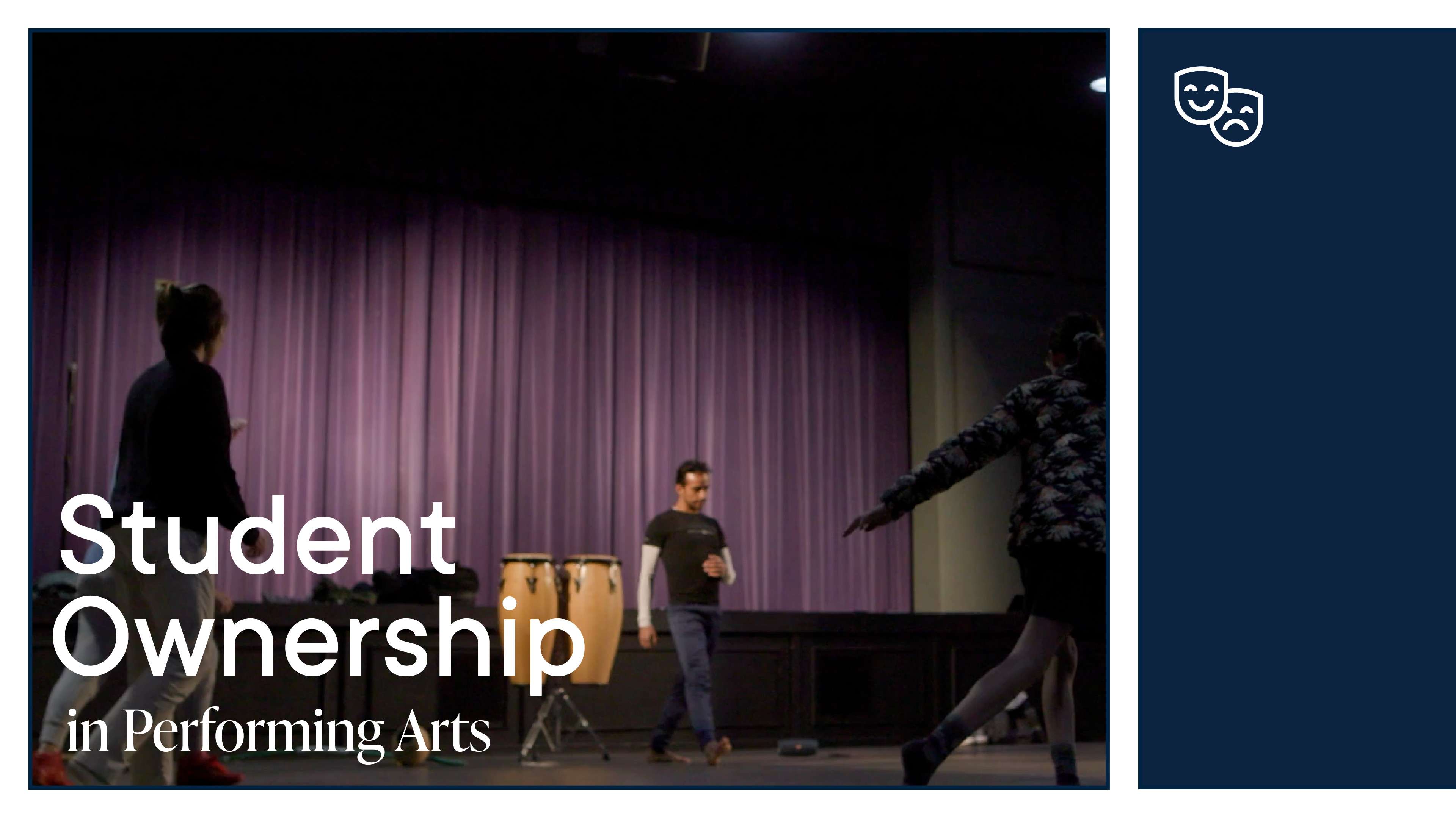
Concept 2

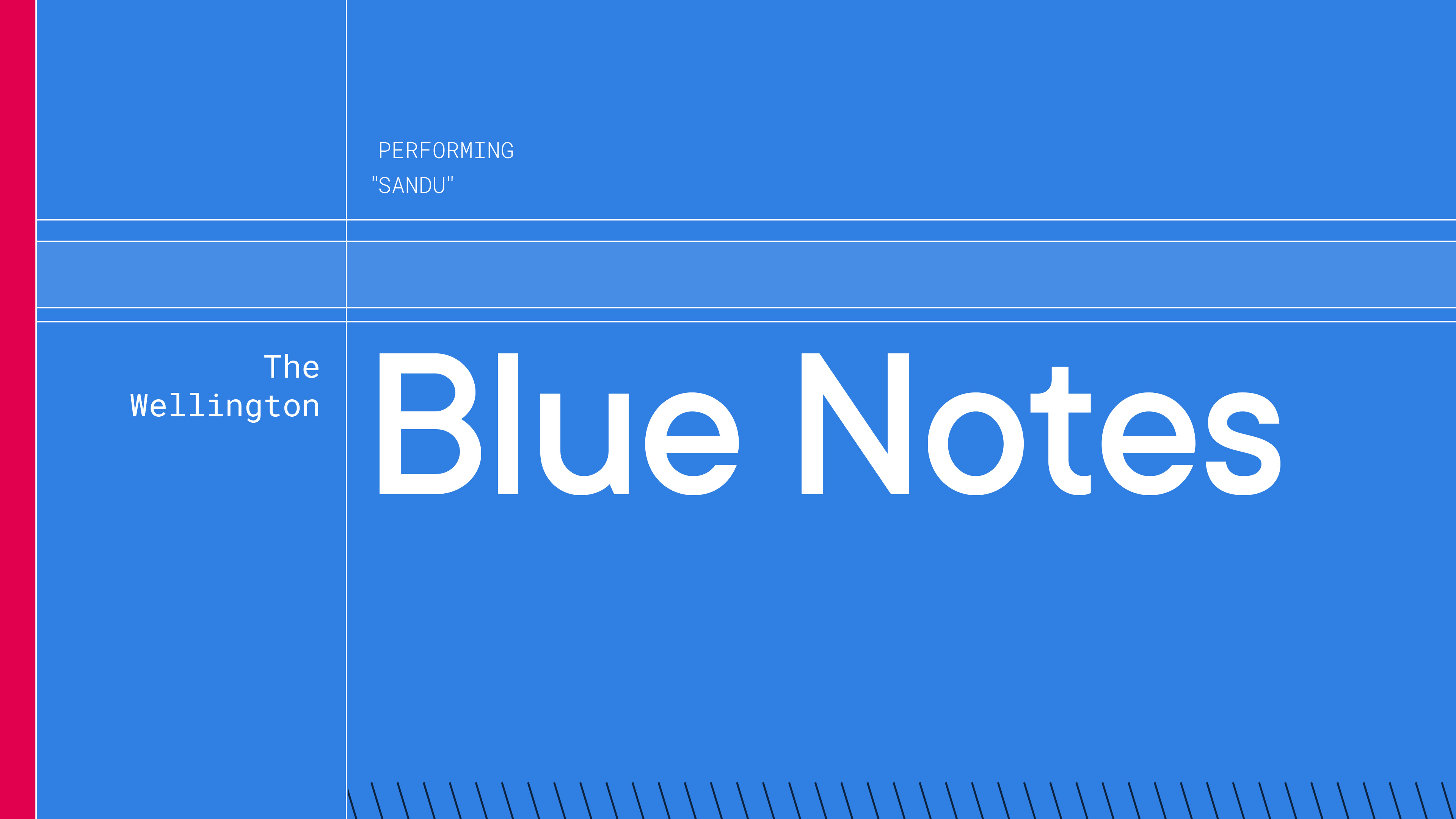
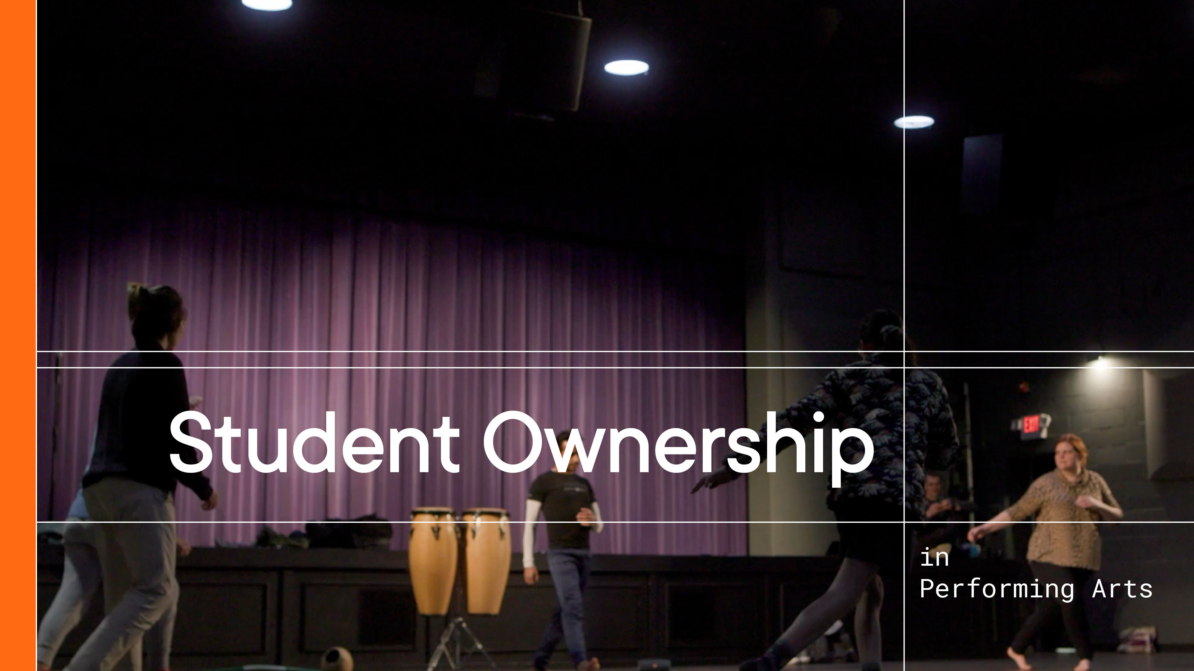
Concept 3


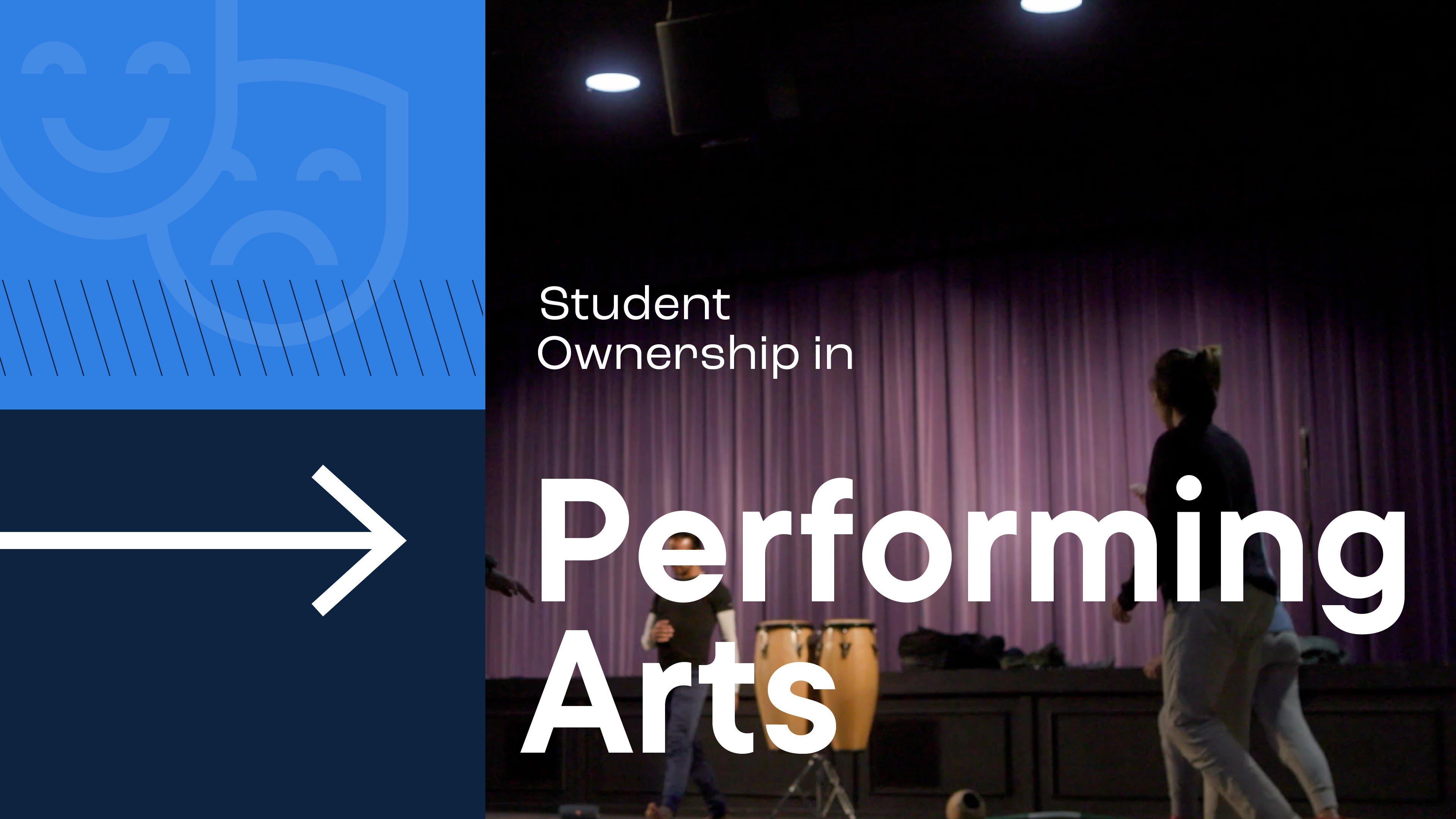
Refinement
The client was most drawn to concepts #2 and #3, with a slight preference towards #2. While they enjoyed #3, they felt that it might be a little too many elements onscreen at once. They also enjoyed the idea of “revealing” things through animation in concept #2, as it was inline with the event’s premise of taking a look behind the scenes. The final style uses the structure of concept #2 while also incorporating some of the contrast and color + decorative elements that were present in #3.
Concept 2
